


First impressions matter. And this window is only milliseconds wide. If your survey doesn't immediately catch people's attention, they will close it right away. This instant judgment underscores the significance of not only a visually appealing survey design but also its ability to convey a sense of relevance and value. A survey that's well-designed doesn't just get noticed, it communicates that it's important and worth people's time, leading to more insightful and valuable responses.
Here are six quick design tips that can boost your survey’s response rates.
Psst. With Smore, you can apply these design tips with a click of a button!
1. Add your logo/symbol to set the tone
Embed your logo on the form, and design your form around it. Adjusting the size of the logo is recommended, so it doesn’t clash with the content of the form.
For square logos, it’s best to leave some padding around the logo shape.

For rectangular logos, make sure the width of the logo fits within the blue rectangle.
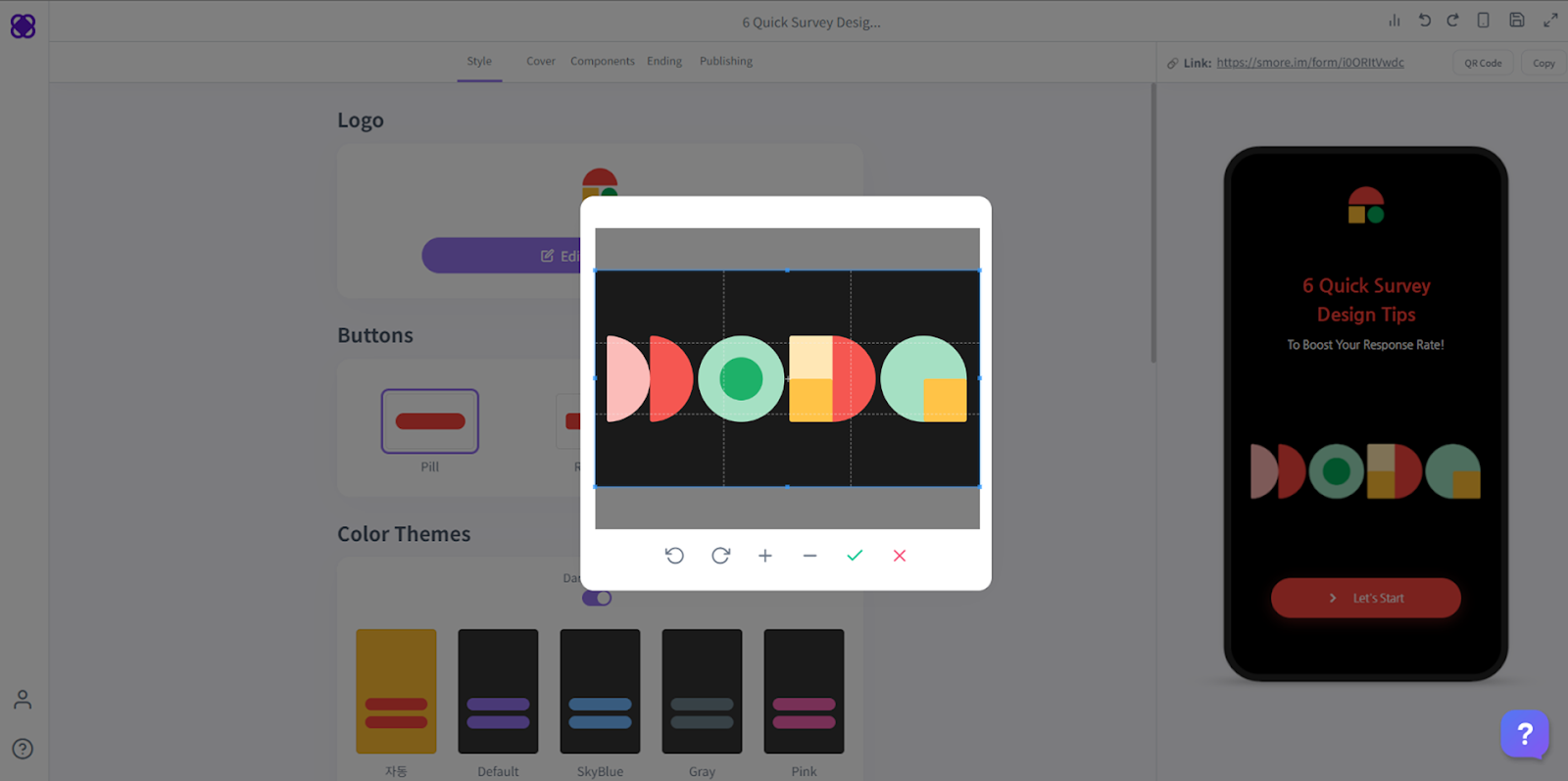
2. Choose button shapes that fit your logo
The shape of the buttons refine the overall aesthetics of the form, and make the branding of the form more solid. With Smore, you can choose from different shapes.
Let’s take a look at the example below. The logo has a lot of curves. The square in the bottom left section of the logo has rounded corners, making the logo feel soft and smooth. The buttons on the left side have rounded corners similar to the logo, whereas the right side has pointed corners.
The best practice is to align the button shape with the logo shape, like the left-side example. If they aren’t aligned, it can disrupt the visual flow of your form.

3. Pick the right accent and background color
It’s best to use the color of your logo as the accent color instead of the background color. On Smore, you can set it to the perfect color without having to adjust the scales pixel by pixel. Simply type in the HEX code of the logo and voila!
It’s best to keep the background color flat and monotone. If the background is too bright, it can overshadow the accent color.

4. Cover that paints a thousand words
The cover image is the very first thing your respondents will see. Here is a checklist of things to consider for your cover image:
- The cover image should give insight into what the form is about
- If there is text in the image, the font should be clear and easy to read
- Use the same color scheme as your logo
- The image should not be pixelated
- The cover image should stand out against the background

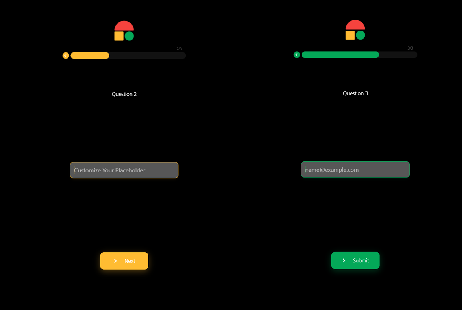
5. Customize the theme for each page
Customizing the theme for each page can make the form feel more dynamic and boost user engagement. Your users will feel less tired while filling out the form and that will lead to lower churn rate. You can still keep the mood consistent by sticking to the color scheme of your logo.
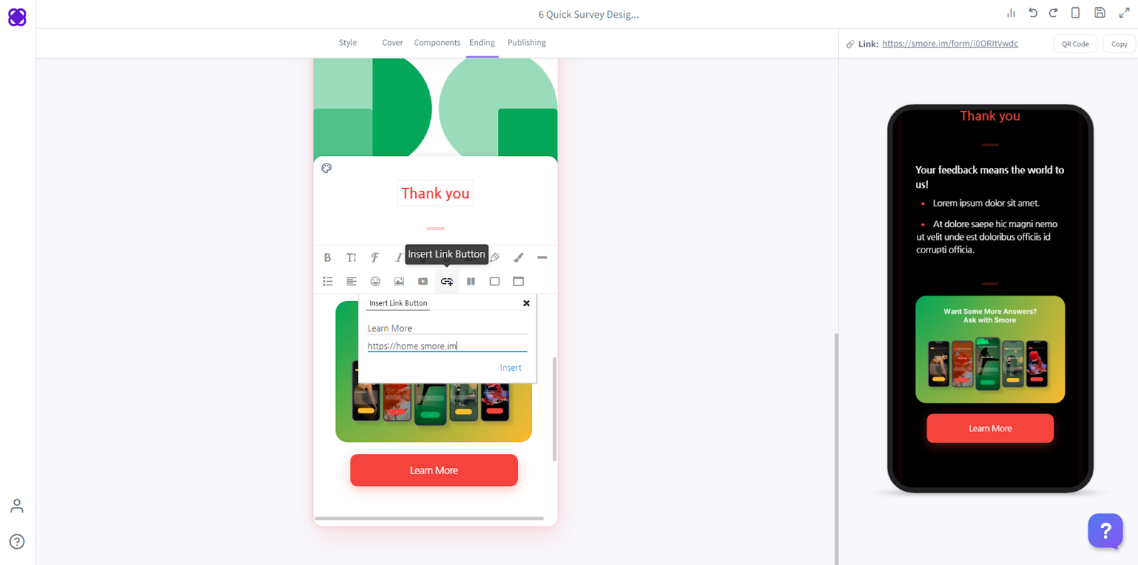
6. Add images and CTA to your ending page
When the respondents hit the submit button and get a thank you message, that immediately terminates their user journey. They run into a dead-end. Adding images and CTA to the ending page allows you to keep the conversation going. Communicate any additional information you want, and keep it interesting by inserting appropriate images.
With Smore, you can hyperlink the images to redirect users to a website you want. Or you can add a CTA button.

Check out this sample form that contains these 6 quick design tips!
Do you want to test these quick 6 tips yourself?